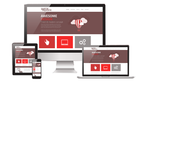
Responsive Website Design
Information Technology Is Our Domain
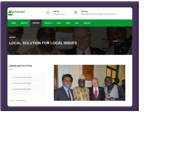
Go To Site (click image)

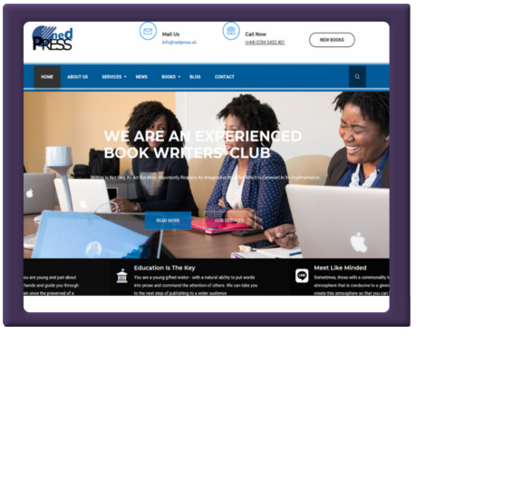
Go To Site (click image)
Go To Site (click image)
With the ever-increasing use of mobile devices, it has become necessary to design on-line content that appears on multiple screen sizes and a myriad of devices with varying form factors. The challenge involves designing sites that adapt to fit a variety of different resolutions and use the available screen real estate effectively. Previously, these goals have proven to be time-consuming. Hand-coded media queries and complex mathematical calculations were often required to deliver on-line presentations with fluid layouts to reach the widest audiences.
Responsive web design (RWD) is essentially based on a fluid grid layout. All containers on the page have their widths defined in percentages - meaning that they are completely based on the viewport rather than the initial containing block. A liquid layout will move in and out when you resize your browser window. Thus, all siblings or nested entities within the container are adjusted correspondingly.
CSS3 media queries - now a standard specification in HTML5 allow designers to dynamically alter the design and layout of a web page in order to deliver an optimal user experience from a single set of HTML, CSS and JavaScript files. The techniques involve in leveraging this powerful capability of CSS also facilitate the change of images, altering navigation style and a whole lot more dynamically.
Bootstrap Simplifies Everything
A project that started in twitter to encourage consistency across internal tools by Mark Otto and Jacob Thornton as far back as 2010 has now metamorphosed in to Bootstrap - a free and open-source CSS framework directed at responsive, mobile-first front-end web development. Bootstrap is a web framework that focuses on simplifying the development of informative web pages (as opposed to web apps). The primary purpose of adding it to a web project is to apply Bootstrap's choices of color, size, font and layout to that project. As such, the primary factor is whether the developers in charge find those choices to their liking. Once added to a project, Bootstrap provides basic style definitions for all HTML elements. The end result is a uniform appearance for prose, tables and form elements across web browsers. In addition, developers can take advantage of CSS classes defined in Bootstrap to further customize the appearance of their contents. For example, Bootstrap has provisioned for light- and dark-colored tables, page headings, more prominent pull quotes, and text with a highlight.Bootstrap also comes with several JavaScript components in the form of jQuery plugins. They provide additional user interface elements such as dialog boxes, tooltips, and carousels. Each Bootstrap component consists of an HTML structure, CSS declarations, and in some cases accompanying JavaScript code. They also extend the functionality of some existing interface elements, including for example an auto-complete function for input fields. The most prominent components of Bootstrap are its layout components, as they affect an entire web page. The basic layout component is called "Container", as every other element in the page is placed in it. Developers can choose between a fixed-width container and a fluid-width container. While the latter always fills the width of the web page, the former uses one of the four predefined fixed widths, depending on the size of the screen showing the page. Suffice to say we use it in all our website design projects.
The Stakeholder
If you're an owner or stakeholder in a website that still employs separate code base for various connecting devices (smart-phone, tablet,desktop, TV etc.etc.) you have a decision to make about your entire website strategy. It's no longer a question of if you need a redesign, but how soon to redeploy your current site implementing RWD. Thus leverage the new specifications in HTML5 and CSS3 to render consistently across various devices. Creating separate website templates and code for phones, smart phones and tablets is completely unnecessary, unproductive notwithstanding cumbersome. Responsive Web Design (RWD) allows your website to respond and display nicely on the device that it is being displayed on. Consequently ending up with a site that provides the same user experience across devices, screen resolutions and varying form factors.It Is The Future
If the aforementioned is not convincing enough how about this fact - there are over 6 billion( and counting) mobile users out there and current trend suggests that smaller screen devices are going to be the browsing 'norm' within the next 2-3 years! Doing nothing is not an option.The main features of Responsive Web Design (RWD) are:
- Optimized Display on All Smart Phones
- Optimized Display on Tablet Devices
- Optimized Display on Desktops
- Optimized User Experience
- Manage the Same Code Base Files for all Devices
Why you should not ignore Responsive Web Design (RWD)
As of last Tuesday 21st April 2015, Google started using mobile-friendliness as a ranking attribute in their search engine results, rewarding web sites that are fully optimized for mobile platforms - i.e have been designed using responsive design construct in their implementation.Google says the effect of this change will be profound. It is therefore very important for any business owner with a web site to respond accordingly. These changes will make it easier for mobile users to find relevant, high-quality search results that are optimized for their devices, creating a better search experience.
If you don't know whether your website is mobile friendly or not, here is what you need to do: Take the Mobile-Friendly Test to see how your website stacks up here Check out Google’s guide to mobile-friendly websites here
Google recommends responsive web design as the industry best practice for websites. A responsive website seamlessly adapts itself to whichever device it is being viewed from. If your web site isn't responsive you could find that it has already started to fall down Google's rankings.
Bespoke Website Design
CMS Solutions Vs Proper Website Design
Content Is King

The exposition of your business or enterprise to a global community (the global village) via the internet is an attribute all and sundry will attest as being the main salient feature of the web. It has literally created a level playing field so to speak for thousands of small businesses or enterprises that hitherto had no way of exposing their services or products to such a world wide customer base. There is though some side effects to this seemingly technological brilliance. You have now got the exposure just like thousands of others but how do you differentiate yourself from others providing similar services? This is where the design of your website and in particular, the content displayed in the interface both graphic assets and contextual text respectively becomes prominent. All graphic assets used as part of the interface design, must accentuate the services or products you are selling.
All written text on your website pages must be simple, clear, explicit, un-convoluted and more importantly be in plain Simple English. One can not emphasis enough the importance of plain simple English. Bear in mind, this is the first interaction between you and a potential customer. Your written text as most people will attest, can so easily labelled your site as not being professional enough. Get it wrong on your home page through a simple typo or a poorly phrased sentence and you are unseemingly or unwittingly diverting potential traffic to your rivals. The internet is very unforgiving with this type of mishap. Rest assured people will make judgement from this experience and the consequence by and large, is not to return to your site. It can get worse - telling others about the poor grammar or aesthetic attribute of your site can propagate on the web like "wild desert fire" and you have every little means of quenching it. In other words, try not to devalue the products or services you provide by poor English grammar - first impression on the web last for eternity even if you are selling gold for pittance.
Always ask a professional copy writer to write all your text messages if you are not competent enough to do it. All sites designed by us by default have their text messages written by professional copy writers and integrated with metadata for optimised SEO results.
Bespoke Web Design